
In today’s digital landscape, adaptability is not just a luxury—it’s a necessity. A website must be more than just a static online presence; it needs to be flexible, responsive, and ready to evolve. The question isn’t just about whether your website looks good or functions well. It’s about whether your website can adapt to the ever-changing demands of technology and user expectations. Is your website flexible?
The Foundation of Flexibility
Website flexibility starts with the foundation. A flexible website isn’t just about having a responsive design (although that’s critical); it’s about having an infrastructure that can grow, change, and adapt without major overhauls. Think about your Content Management System (CMS). Is it robust? Can it handle updates smoothly? WordPress, for example, is known for its flexibility. It allows you to easily add new features, update existing ones, and integrate with a wide range of tools.
Consider this: a flexible website isn’t bound by rigid templates or limited functionalities. It’s built on a foundation that anticipates growth. It’s prepared for new content types, media formats, and even changes in branding. This flexibility ensures that as your business evolves, your website can evolve alongside it—seamlessly, without disruption.
One of the best practices in building a flexible website is choosing a theme that’s not only visually appealing but also highly customizable. Themes like Astra or GeneratePress offer a balance between aesthetics and flexibility. They allow for deep customization without requiring you to touch the code, making it easier for even non-developers to manage and modify their website.
The Role of Responsive Design
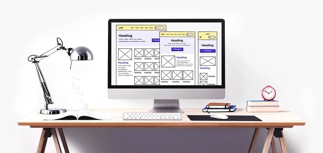
Responsive design is a term you’ve likely heard countless times. It’s not just a buzzword; it’s the cornerstone of a flexible website. But what does it really mean? Responsive design ensures that your website functions perfectly across all devices—whether it’s a smartphone, tablet, or desktop. It’s about fluid grids, flexible images, and CSS media queries. But more than that, it’s about providing a consistent user experience, no matter how or where your audience accesses your site.
But responsive design is more than just shrinking or expanding content to fit different screen sizes. It’s about rethinking the user experience based on the device in use. A truly responsive design considers how content is displayed on smaller screens, how navigation is handled, and how touch interactions replace clicks.
Take, for example, a complex navigation menu. On a desktop, it might be fine to have multiple drop-downs, but on a mobile device, that same menu could overwhelm the user. A flexible website anticipates these challenges and adjusts accordingly—perhaps by using a hamburger menu or simplifying navigation options on smaller screens.
And let’s not forget performance. A flexible, responsive design also considers load times. Images are optimized, unnecessary scripts are deferred, and caching strategies are employed—all to ensure that your site loads quickly on any device. Remember, flexibility isn’t just about appearance; it’s also about performance.
Content Flexibility
Content is the lifeblood of your website. But content isn’t static. It changes, evolves, and grows. A flexible website is designed to handle this dynamic nature of content. Whether it’s blog posts, videos, or podcasts, your website should be able to present your content in a way that’s both engaging and easy to navigate.
Think about how your content is structured. Are you using a page builder like Elementor or Beaver Builder? These tools allow you to create custom layouts for your content, making it easy to adjust and adapt as your needs change. They offer a drag-and-drop interface that enables you to design pages without needing to write a single line of code.
Moreover, a flexible website anticipates the need for content updates. Let’s say you run a blog. As your expertise grows, you may want to update older posts with new insights or information. A flexible website makes this process seamless. It allows you to make updates without breaking your site’s design or functionality.
Internal linking is another aspect of content flexibility. By strategically linking to other relevant content on your site—like this post on Collect Dividends by Investing in a Technical Audit of Your Website—you not only improve SEO but also guide your readers to related content that enhances their understanding of the topic at hand.
In addition, consider content management. With a flexible website, you’re not limited to standard text and images. You can easily integrate videos, podcasts, infographics, and even interactive content. The ability to manage various content types without friction is a key element of a flexible website.
Future-Proofing Your Website
The digital world is always changing. What works today may not work tomorrow. A flexible website isn’t just about being adaptable in the present; it’s about being ready for the future. This means your website should be built with scalability in mind. You might not need an e-commerce platform now, but what if you decide to sell products online next year? A flexible website can accommodate that growth without requiring a complete redesign.
Similarly, consider SEO. Search engine algorithms are constantly evolving. A flexible website is one that can adapt to these changes without losing its ranking. This might involve adding new content, tweaking metadata, or improving site speed. Flexibility ensures that your site remains competitive in search engine rankings, no matter how the rules change.
Another key aspect of future-proofing is security. A flexible website is one that’s easy to update, especially when it comes to security patches. With WordPress, for example, updating your website’s core files, plugins, and themes can be done with a few clicks. Regular updates ensure that your site remains secure against new vulnerabilities.
Finally, don’t overlook the importance of backups. A flexible website includes a robust backup solution. Should anything go wrong—whether it’s a hacker attack, a server failure, or a botched update—a flexible website can be quickly restored from a recent backup, minimizing downtime and disruption.
Conclusion: Is Your Website Flexible?
In a world where technology and user expectations are constantly evolving, a flexible website is essential. It’s not just about having a site that looks good; it’s about having a site that can grow, adapt, and change as your business does. From a robust CMS to responsive design and content management, flexibility is the key to staying relevant and competitive.
So, is your website flexible? If not, it might be time to take a closer look at your site’s foundation, design, and content strategy. Investing in flexibility today will pay dividends in the future. Ready to make your website more flexible? Let’s start the conversation. Contact us today to learn how we can help.