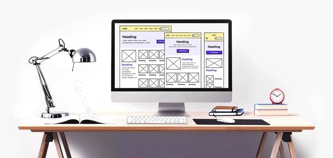
Responsive Wireframing: Designing for Every Screen Size
As more and more people access the internet on their mobile devices, it has become essential to design websites and applications that are responsive to different screen sizes. This is where responsive wireframing comes in – it allows designers to create wireframes that adapt to different devices and screen sizes, ensuring that the user experience remains consistent and seamless across all devices.
Responsive wireframing involves designing wireframes that are flexible and scalable and can adapt to different screen sizes without losing their visual appeal or functionality. This requires a deep understanding of the design principles and best practices that underpin the responsive design, as well as the technical skills to implement these principles in a wireframe.
One of the key benefits of responsive wireframing is that it helps designers to create a more inclusive user experience. By designing for a wide range of screen sizes, designers can ensure that their products are accessible to users with different devices and abilities. This can help to increase engagement and conversions, as well as improve user satisfaction and loyalty.
Another benefit of responsive wireframing is that it can help to speed up the design and development process. By designing wireframes that are adaptable and scalable, designers can create a framework that can be easily translated into a fully-functional website or application. This can help to reduce the time and resources required for development and can help to bring products to market faster.
If you’re interested in learning more about responsive wireframing or need help creating responsive wireframes for your website or application, contact a UX design expert today to get started. With their expertise and guidance, you can create wireframes that are both beautiful and functional, and that provide a seamless user experience across all devices.