Not Enough Preparation
It is imperative that a clean and easy user experience is implemented early on. The longer you wait, the more changes you will have to make and it will cost you a lot more time and possibly money. UX should be one of the highest priorities on your list, as this is normally the most important fulfillment users need. UX should not be added in half-heartedly later on after the product is launched.
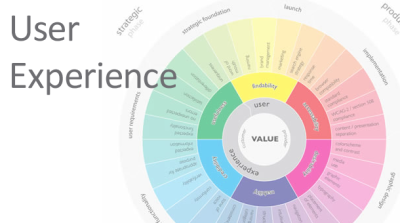
Research, test, and be confident in your user experience before you plan on launching it, even in beta. A solid user experience can lead to a better, cleaner design in the long run.
Clear Goals
Whether this is a new blog talking about the latest web technologies, or an amazing startup launching a new product, it is extremely important to show a clear goal. When a user finds your site or product they should be able to know exactly what it is within seconds of seeing your site. This should be the most important and forefront element on the page. A nice simple header explaining your service, maybe a quick paragraph about it, and an image or video is all you need on the landing page.
Keep it simple and explain your product. Get the core description right, and the right users will come.
Too Much Text
Research shows that users are much more engaged with visual or audio cues. When designing keep in mind not to overload on text and to provide some visuals and possibly video or audio to make the website or app interesting. An interaction here and there is always nice and will keep users enthralled in the simple, but interesting features your site has to offer.
Do keep in mind not to over-complicate it though. Features are nice, but not if it is preventing the user from using your actual service. Define the goal of the user, and help them reach it. What do you want the user to do when visiting your site or app, how should they interact with it, what problems might they face? These are just a few of the many questions you could & should ask when designing and developing a new product.
Microcopy
Copy on a website is the text or the words that describe the product and help sort of “sell” the service. As explained by designer Gene Crawford, it is important to clearly define your product and add helpful text to guide the user through your site. Be a defensive designer. Offer help where it is needed and always be ready to help even more. Users need context, so give it to them. Never use jargon or poorly written copy. Copy could make the difference between a new user, and an upset/confused visitor on your site.
Cluttered Forms
Another mistake that is made on a ton of websites are the forms. Whether it be a contact form or a sign up/sign in form, some have a common problem: Too many fields. When building and developing your forms add only the absolute most important fields that are necessary. It is imperative not to clutter the form and make it so the user must add a bunch of extra details when all that is needed are a few things like a name, email, and message for example.
Information Overload
When starting out, a lot of designers feel the need to cram crazy amounts of information on a single page. Posts, ads, icons, social media links, email lists, and pop-ups can seriously affect the experience of a new user on the site, not to mention it can easily make them turn away and just leave the site.
When designing a new site, consider organizing the information in a way that is easy on the eyes. Clearly define headers and paragraphs, separate information, use white space where it is necessary, and try to organize social links along with ads or other extraneous information in a subtle manner so as to not put a burden on the user.