Introduction
The homepage: it’s the first impression, the digital handshake, the gateway to everything your business has to offer. For many visitors, it’s the deciding factor in whether they’ll continue exploring your site or hit the back button and move on. Crafting a homepage that doesn’t just look good but also drives conversions requires more than flashy graphics or clever taglines. It’s a strategic blend of user experience, design, and persuasive copy—all meticulously arranged to lead visitors toward a clear call to action.

In today’s competitive digital landscape, where attention spans are shorter than ever, your homepage needs to do more than just sit pretty. It has to work as hard as you do. In this guide, we’ll explore the essential elements of a high-impact homepage, from compelling headlines to optimized layouts, all designed to transform casual visitors into loyal customers. Whether you’re building from scratch or refining your current design, these strategies will put you on the path to a homepage that captivates, informs, and converts.
Nail the First Impression with a Powerful Headline and Subheading
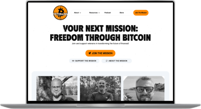
Every great homepage begins with a headline that grabs attention and immediately communicates value. Imagine yourself as a visitor: the first few seconds are crucial. A vague, generic headline like “Welcome to Our Website” is more likely to bore than engage. Instead, lead with a headline that speaks directly to your audience’s needs or pain points.
For instance, a web design agency might use, “Transform Your Online Presence—Start Converting More Leads Today.” This headline is action-oriented and solution-focused, and it tells the visitor exactly what they can expect.
A complementary subheading can further support the headline by offering a bit more context, perhaps something like: “Our tailored web solutions are designed to drive growth, engagement, and conversions. Discover the power of a well-crafted website.” This additional layer provides clarity and sets the stage for your value proposition.
Pro tip: Keep headlines short and impactful, around six to ten words, and avoid jargon. Simple, straightforward language resonates best.
Optimize Your Layout for Clarity and Flow
The structure of your homepage should guide visitors seamlessly through your content, helping them quickly find the information they need. When designing a homepage, think of it as a journey: visitors should move effortlessly from one section to the next, following a natural hierarchy of information.
Use a “Z” or “F” Pattern for Scanning
Studies show that users generally read in an “F” or “Z” pattern, especially on websites. The “F” pattern follows a more vertical scan, often ideal for content-heavy sites, while the “Z” pattern works well for pages with balanced visuals and text. By placing essential elements like headlines, calls to action, and key imagery along these lines, you can subtly guide your visitors’ eyes toward the most crucial parts of the page.

Prioritize Above-the-Fold Content
Above-the-fold refers to the visible part of a webpage before the user scrolls down. This section is prime real estate, where you want to place your most compelling content: a strong headline, subheading, and primary call-to-action (CTA) button. For instance, if you’re aiming for leads, include a prominent “Get Started” or “Book a Consultation” button right there. Avoid clutter in this space; the clearer your above-the-fold content, the more likely visitors are to stay and scroll.
Design Tip: Use white space to create breathing room. Crowded, text-heavy layouts can overwhelm visitors. Balance text with clean visuals, like product images, icons, or short video clips that speak directly to your value proposition.
Use Social Proof and Trust Signals to Build Credibility
We’re naturally inclined to follow the actions of others, especially when making decisions online. That’s where social proof and trust signals come in. Integrating these elements into your homepage can reassure visitors of your reliability, building confidence in your brand and encouraging conversions.
Show Client Testimonials and Case Studies
Testimonials are one of the simplest and most effective forms of social proof. Consider featuring quotes from satisfied customers, especially those who represent your target audience. A specific, result-oriented testimonial (e.g., “Our conversion rates increased by 35% after launching our new website with [Your Business Name]”) is far more convincing than a general, “We love working with them!”
For even greater impact, include a brief case study of a successful project. Summarize the client’s initial challenge, your solution, and the results. Not only does this showcase your expertise, but it also gives prospective clients a sense of what they can expect.
Advanced Tip: Embed a call-to-action near testimonials or case studies, such as “See More Success Stories” or “Let’s Create Yours.” This encourages visitors to dig deeper into your credibility and services.
Add Logos of Recognized Brands or Certifications
Displaying logos of well-known clients or industry certifications lends immediate credibility. Even if you’re a small business or freelancer, mentioning partnerships with reputable companies or certifications in relevant areas (such as Google Analytics, HubSpot, or WordPress) can provide that additional trust factor.
Make Calls to Action Stand Out
A high-impact homepage isn’t just informative; it’s persuasive. Every section should work toward nudging the visitor one step closer to conversion. The secret weapon? Effective calls to action that are bold, visible, and compelling.
Use Action-Oriented Language
Avoid bland phrasing like “Submit” or “Learn More.” Instead, go for action-oriented verbs that inspire users, such as “Start Your Free Trial,” “Claim Your Spot,” or “Get a Quote Today.” When paired with a value-driven message, this language creates a sense of urgency and personal benefit.
Repeat, But Don’t Overdo It
Place CTAs strategically throughout the page, but don’t overwhelm visitors with them. Typically, one primary CTA above the fold, another after key sections (such as testimonials or services), and a final CTA at the bottom of the page is enough. Each CTA can lead to the same action, but try to vary the wording slightly to maintain interest.
Conclusion: Transform Your Homepage and Watch Your Business Thrive
Creating a high-impact homepage that converts is about understanding the psychology of your audience and guiding them toward a goal. From the headline that grabs attention to the CTAs that inspire action, each element plays a role in moving visitors closer to conversion. Remember, simplicity, clarity, and purpose are your allies.
Ready to take your website’s performance to the next level? Collect dividends by investing in a technical audit of your website—it’s a powerful way to identify areas for improvement and boost conversions. And if you’d like to chat about how our team can help optimize your homepage for maximum impact, don’t hesitate to reach out. Let’s turn your visitors into loyal customers, starting today!